
5 Design Principles Everyone Needs to Know
By Justin Cox | August 10, 2025
Let’s get one thing out of the way: You do not need a graphic design degree to create a solid social media post.
Design tools are more accessible than ever. Canva templates, stock libraries, and drag-and-drop features make it possible for almost anyone to create content. That is a great thing!
But access to design tools does not automatically make every design decision work.
You can choose the right dimensions, use your brand colors, add your logo, and still end up with a graphic that feels a little… off. Maybe it is difficult to read. Maybe you are not sure where to look first. Or maybe there is so much happening that the message gets lost completely.
As a Design Manager, I review a lot of social content. Most design problems are not caused by a lack of creativity or expensive software. They usually come back to a few basic design principles.
1. HIERARCHY: TELL PEOPLE WHERE TO LOOK FIRST
Every design needs a clear starting point.
When someone sees your post, what should they notice first? The headline? The product? A statistic? That element should be the most visually important part of the design.
Designers create hierarchy through size, color, placement, font weight, and spacing. A large, bold headline will usually attract attention before a smaller line of supporting copy.
The biggest mistake is trying to make everything important. If the headline, date, logo, website, and call to action are all large and bold, they begin competing with one another.
Choose one primary message and let the remaining information support it.
A quick way to check your hierarchy is the squint test. Zoom out or squint at the design until the smaller details become blurry. What still stands out? If it is not the main message, your hierarchy needs some work.
This blog post by our Creative Director, Claire, is a great resource if you want to take a full deep dive on design hierarchy.
AMR Pro-Tip: Keep each graphic focused on one primary message. If you are creating a carousel, use the additional slides instead of squeezing everything onto the first slide.
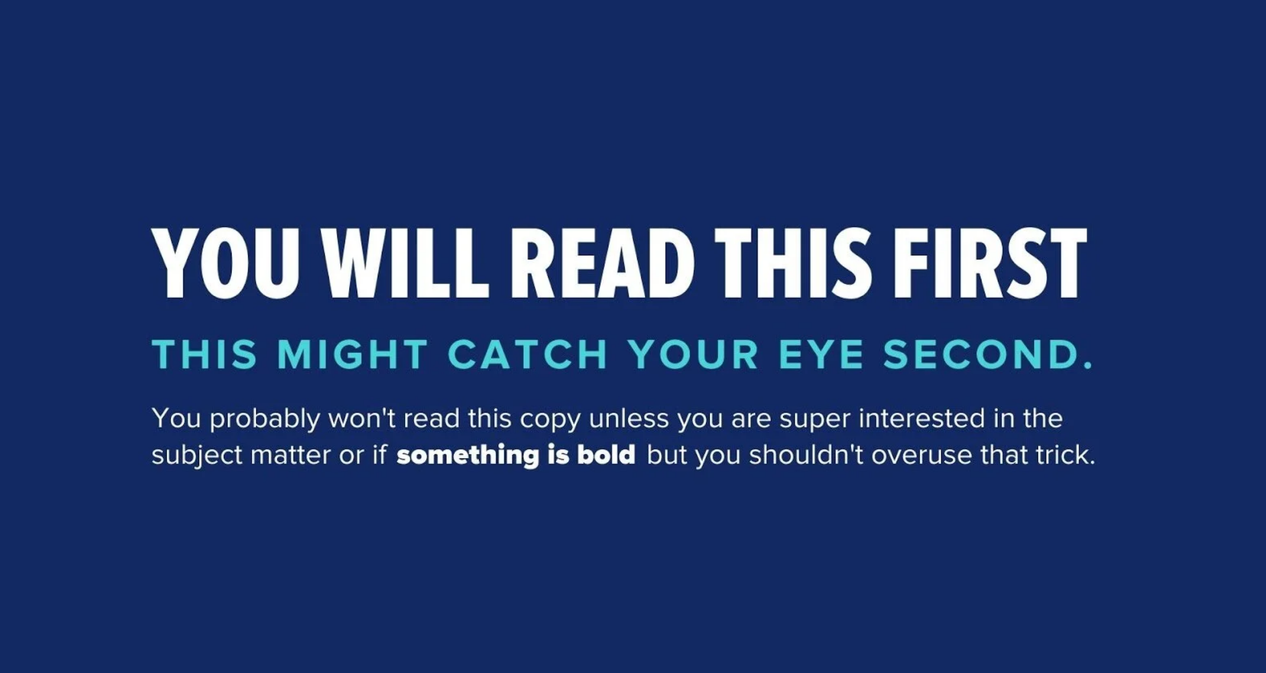
2. CONTRAST: MAKE DIFFERENCES OBVIOUS
Contrast makes one element noticeably different from another.
That can mean white text on a dark background, but contrast also comes from size, shape, spacing, font weight, and texture.
Good contrast makes content easier to scan. Poor contrast forces the viewer to work harder, and social media users rarely slow down to decode a post.
One common issue is using colors that are technically different but still too similar. Light gray text on a white background may match your brand palette, but that does not mean it is easy to read. The same applies to text placed over a busy image without a background, overlay, or shadow.
Contrast is also an accessibility issue. The Web Content Accessibility Guidelines recommend a contrast ratio of at least 4.5:1 for most standard-sized text and 3:1 for large text.
Your design should remain clear across different phones, screens, and brightness settings (not just the computer where you created it).

3. ALIGNMENT: MAKE EVERY ELEMENT FEEL INTENTIONAL
Alignment is easy to overlook when it is working and hard to ignore when it is not.
Text, images, icons, and logos should line up along shared edges or within a consistent grid. When elements are almost aligned, the layout can feel sloppy even if the viewer cannot explain why.
For example, if a paragraph begins just a few pixels to the right of the headline above it, it may look like a mistake. Moving both elements onto the same invisible line immediately creates more structure.
Use the guides, grids, rulers, and snapping tools built into your design program. They are there for a reason.
You also do not need to center everything. Center alignment works well for short headlines and simple announcements, but it becomes difficult to read when used for longer copy.
Choose an alignment and commit to it. When in doubt, left alignment is usually the safest and easiest to scan.
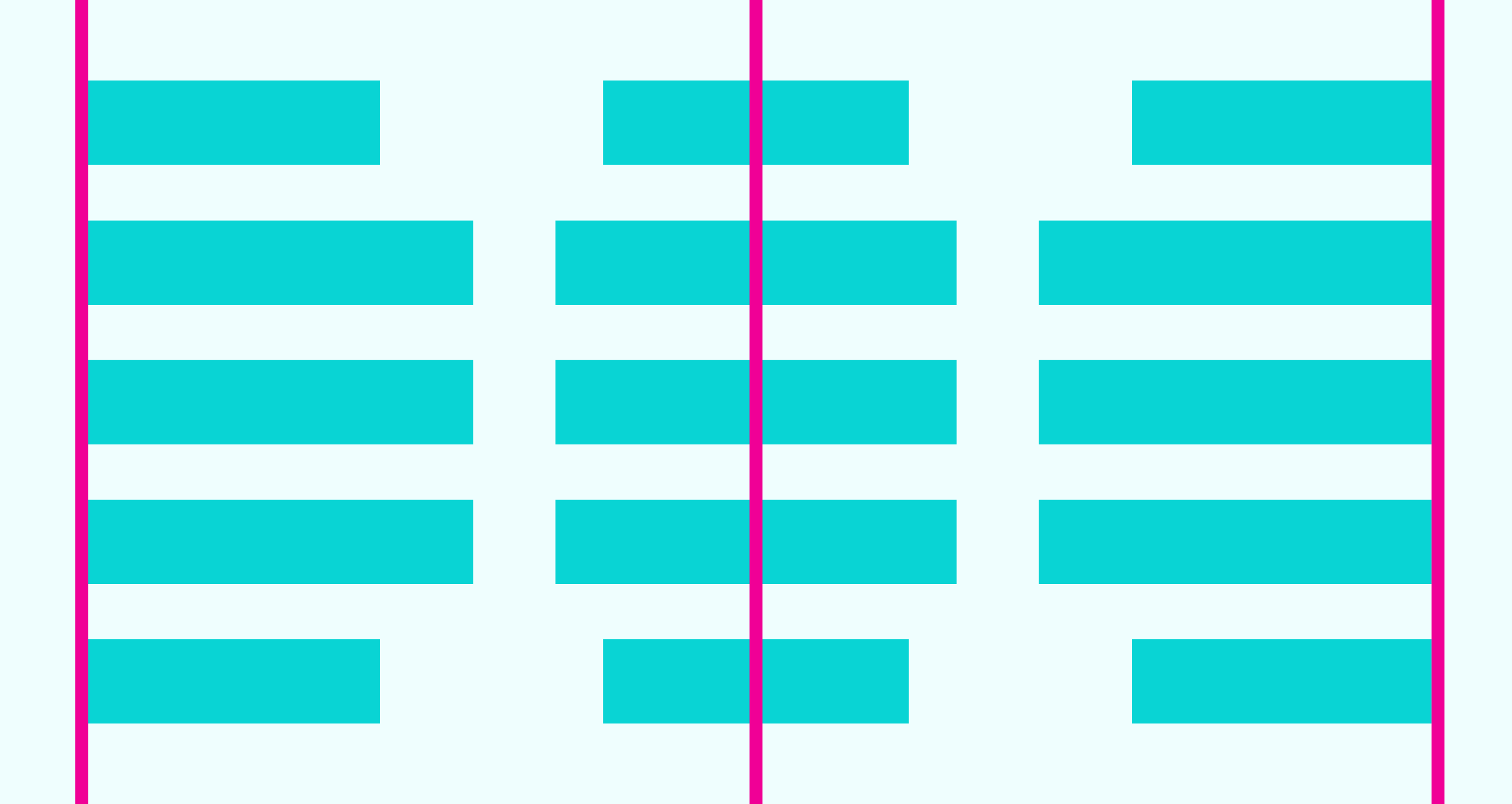
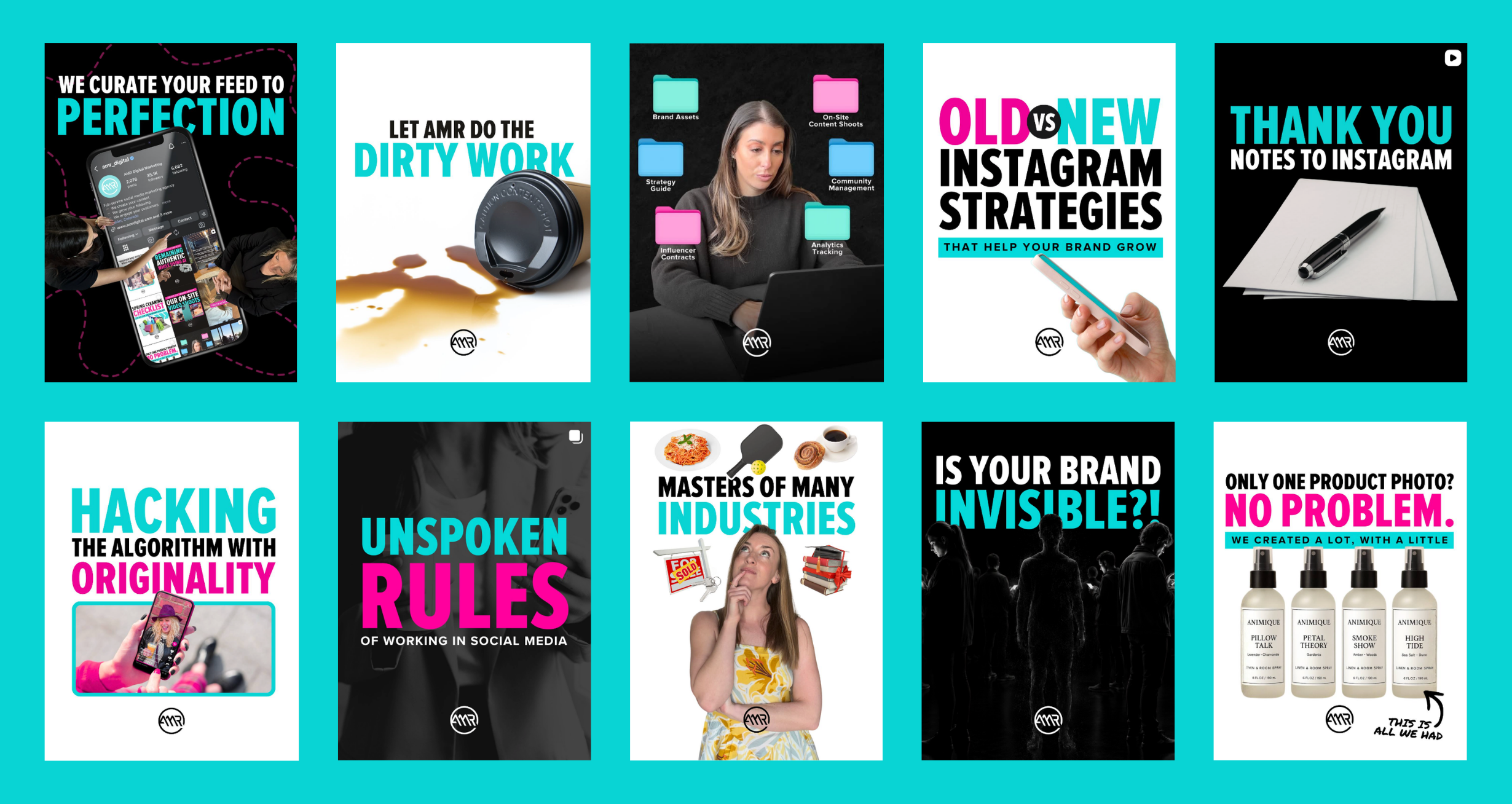
4. CONSISTENCY: CREATE RECOGNITION THROUGH REPETITION
Consistency helps separate branded content from a random collection of graphics.
Your audience should begin to recognize your posts before they notice your logo.
That recognition may come from repeated colors, typefaces, photography styles, layouts, icons, or editing choices: all techniques that can help create harmony and consistency across a design.
This does not mean every post should use the same template. Consistency should come from the design rules, not from copying and pasting one layout forever.
A brand might consistently use two typefaces, a specific color palette, rounded image frames, bold headlines, and a recognizable photography treatment. The layout can change while those core elements remain familiar.
This becomes especially important when several people create content for the same company. Without clear rules, each person may interpret the brand differently.
A brand guide does not need to be 100 pages long. Even one page outlining approved fonts, colors, logo usage, and image styles can make a major difference.
5. SPACE: GIVE YOUR MESSAGE ROOM TO BREATHE
Empty space is not wasted space.
White space, also called negative space, is the open area around text, images, and other elements. It helps separate information, create emphasis, and make a design feel less overwhelming.
A common mistake is assuming that an empty area makes a graphic look unfinished. That often leads to adding another icon, enlarging the logo, stretching the headline, or including a decorative shape that serves no real purpose.
Before adding something, ask what it contributes. Does it make the message clearer, guide the viewer, or support the brand? Or are you simply uncomfortable with the empty space?
Sometimes the best design decision is deleting something.
Headlines need room around them. Paragraphs need enough line spacing to stay readable. Logos should not be pushed against the edge of the canvas.
When a design feels too busy, do not immediately start rearranging everything. First, see what you can remove.
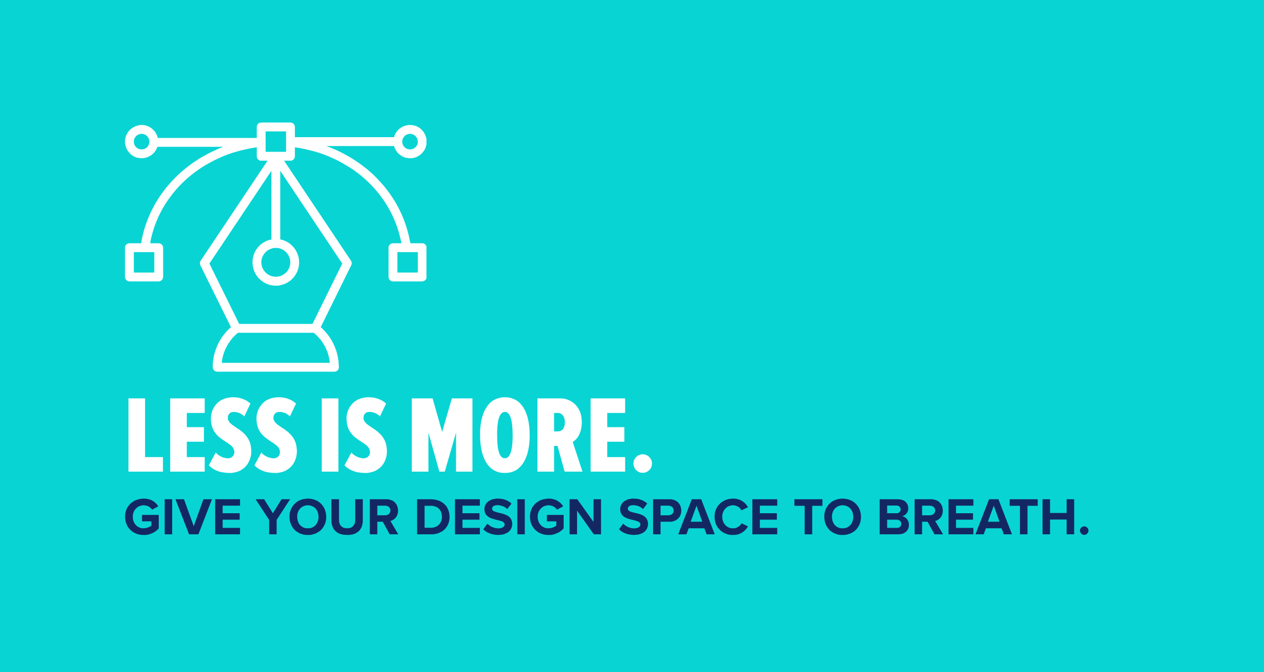
GOOD DESIGN IS ABOUT MAKING DECISIONS ON PURPOSE
You do not need to be a professional designer to create better content. You just need to be more intentional about the choices you are making.
Before exporting your next graphic, ask yourself five questions:
Is it obvious what the viewer should look at first?
Is there enough contrast to read everything comfortably?
Do the elements line up in a way that feels intentional?
Does the design look and feel like the brand?
Is there enough space for the message to breathe?
If you can answer yes to all five, you are already ahead of a lot of content being posted online.
Trends, tools, and platforms will continue to change. These design principles will not. Whether you are working in Canva, Adobe, Figma, or another design program, they can help you create content that is clearer, more professional, and easier for your audience to understand.
Bookmark this blog and run through it the next time a design feels a little “off.” Chances are, one of these five design principles will help you figure out exactly what needs to change.

Justin Cox
Justin Cox is the Design Manager at AMR Digital. Justin has a background in graphic design and is passionate about all things design and content creation. When he’s not busy pushing pixels, you can find Justin outside in Denver with his three (yes, three!) dogs or watching a hockey game that he may or may not be a little too emotionally invested in.