
Your AI Social Posts and Flyers Are Trying Too Hard, and It’s Costing You Customers
By Claire Sprague | October 7, 2026
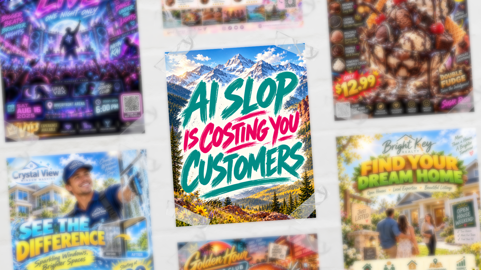
Let's talk about the flyer or social post sitting in your drafts right now. Six suspiciously familiar fonts, every important detail about your business seems to fit, and maybe a photo that's a little too shiny to be real. You know the one.
You're not a designer. You never claimed to be. And using AI, you were able to pop out something that actually looked pretty good. Decent-ish layout, nice colors, a professional-looking photo. You felt good about it. Finally, something that didn't take you 3 hours to create in Canva that you still weren’t happy with…(but we can help with that, too!).
And then you started noticing it everywhere.
The same glossy, slightly-too-perfect look on the coffee shop's Instagram. The flyer taped up at the gym. Three different local businesses' posts in the same scroll session. Once you see it, you can't stop seeing it. And now, instead of looking professional, it just looks like everyone grabbed the same tool and got the same result.
Here's the thing: your customers are noticing too. And when they scroll past, they're not remembering nearly as much as you think.
Literally me when this happens: https://www.instagram.com/reels/DdHIcyZRSWe/
The “too much information” problem
Here's what's tricky about it: these designs are actually following some of the important hierarchy rules. The important stuff is bigger, the fine print is smaller, colors are used with some intention. Technically, it's doing what it's supposed to do. So it feels like it's working.
The problem is what's underneath all that hierarchy. Every detail you could possibly think to include. Hours, specials, address, phone number, a QR code, your slogan, a little icon for good measure. This is how it feels, actually. Good hierarchy on top of too much information is still too much information; it's just more organized about it.
Because hierarchy only gets you so far if you're ignoring the billboard rule. People have to understand your message in 3 seconds or less. That means people are breezing past your flyer or scrolling past your post the same way they'd breeze past a billboard on the highway. They are not standing there reading it top to bottom. Most people will walk away remembering about six words. That's it. Six.
So ask yourself, what are the six words you need someone to remember? "New hours, same great service"? "Grand opening, this Saturday only"? If your graphic can't survive being reduced to six words, it's not going to survive a two-second glance either, no matter how nicely it's organized.
Here's where social media actually works in your favor, though: you're not stuck with just one graphic. Use the caption to fill in what the design can't hold. Turn it into a series of posts or a carousel instead of one crammed graphic. Or push people to a landing page or RSVP page for all the nitty-gritty, hours, pricing, the full rundown, and let the post just be the hook that gets them there. The graphic's only job is to make someone stop and want to know more. It doesn't have to do everything.
See what I mean: https://www.instagram.com/p/Da0WXrIEeo-/?img_index=1
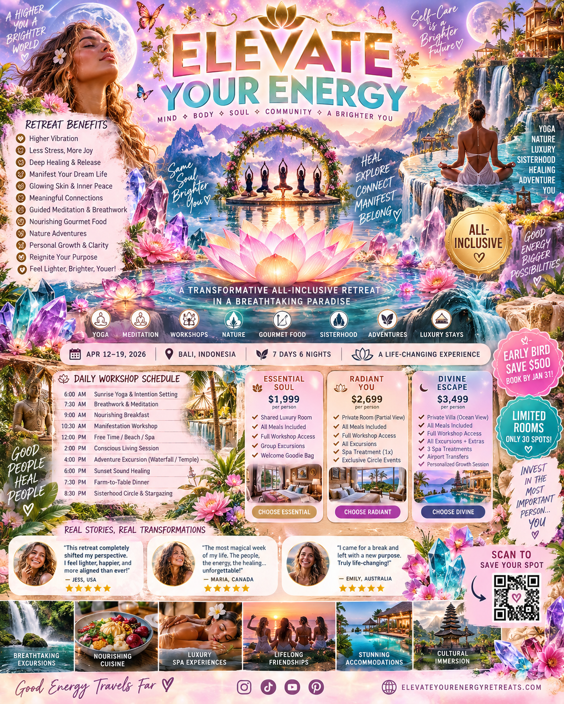
Exhibit A: Information Overload
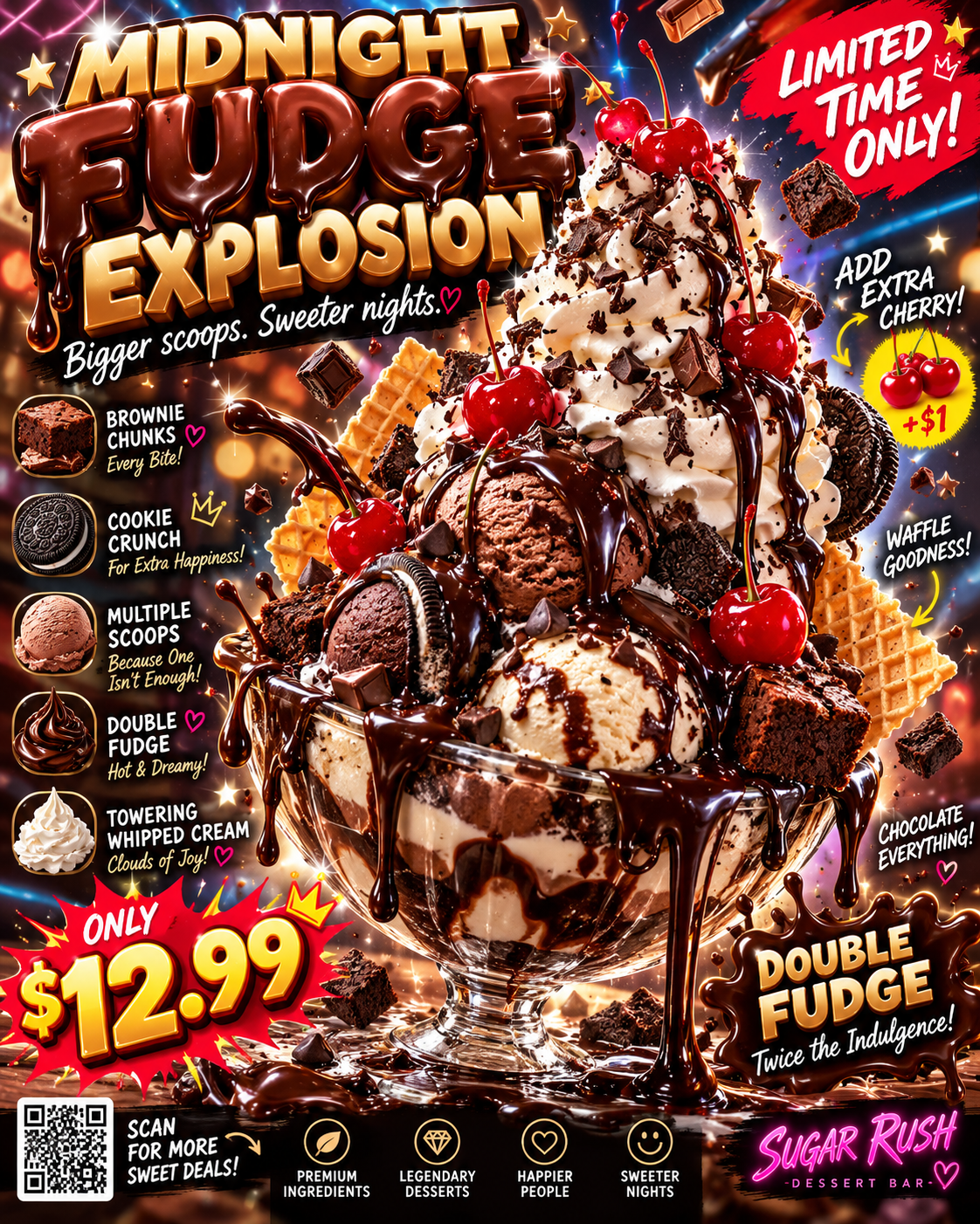
Exhibit B: Fake Product “Photos”

Exhibit C: Shiny Photos & Vaguely Recognizable People
But wait, there’s more. The fake photo problem.
I was at a farmers market recently and saw the divide play out in real time. A few booths had AI-generated stand-up banners advertising their menu, food that looked glossy and stylized and, frankly, looked nothing like what they were actually handing out. Then there was a mom-and-pop burrito stand with their options handwritten on a nice background. Guess which line was longer.
That's not a coincidence. If you're a small local business, an AI-generated image is sending the wrong message, no matter what it's a picture of. People don't choose their neighborhood spot, or stop scrolling on their feed, because it looks like a stock photo. They stop because it's real. A little rough around the edges. Run by actual people you could run into at the grocery store, or, apparently, at a farmers market.
So when your flyer or post looks like it came out of a corporate content mill, you're accidentally telling people the opposite of what you want them to believe. Ironic, since the whole point was probably to look more polished.
Honestly? I'd rather see a menu board with three options crossed out in Sharpie because you sold out. I'd rather see a handwritten sign, a photo someone actually took on their phone, even a slightly crooked one. That's not "unprofessional," that's proof of life. It says real people are behind this, and it's happening right now. You cannot fake that kind of credibility with a render, whatever you're advertising.
And I'm not just being nostalgic about it. A study by Bynder found that 52% of consumers disengage from content they suspect is AI-generated, while 25% find it impersonal, 20% view it as untrustworthy, and another 20% straight up think the brand is lazy. That's the opposite of everything a flyer or post is supposed to do for you. And it’s not just small businesses, even big brands like Walmart are taking a stand against AI slop.
A couple of real examples
Still, as you scroll social media, you are bound to see some of this slop. Refreshingly, I’ve started to see some brands really pushing back, and I’m here for it!
Using a real graphic design major, groundbreaking!
https://www.instagram.com/p/DczSpAGgSCG/?img_index=1
A reporter asks food vendors on both sides of the debate at the NY State Fair:
https://www.instagram.com/p/Dc3nP-DkRax/
So what do you do instead?
Do the six-word test first. Write your flyer or graphic, walk away, come back in ten minutes, and cover it with your hand except for the biggest line. Read only that. If it doesn't tell someone what to do and why they should care, it's not working yet. Save everything else for the caption, a follow-up post, or a landing page.
Then skip the AI-generated images. If you don't have real photos, lean into type, color, and a strong handwritten or hand-lettered element instead of trying to fake a photoshoot.
For the record, I’m not anti-AI. There are excellent AI tools out there that can help you make genuinely scroll-stopping content. But it's not as simple as typing three words and hitting generate. You still need an eye for design, and you need to know how to write a good prompt — one that's specific, that understands composition and lighting and tone, not just "make me a flyer."
Here's an example of the kind of thing I mean, and honestly, I love it: https://www.instagram.com/reels/DaiJDtjTJik/. That's the difference between a tool doing the work for you and a tool doing the work you tell it to do.
And if you want flyers and posts that actually look like your business (not a template with your name pasted on) instead of a font family, we do that here at AMR Digital.

Claire Sprague
Claire Sprague is the Creative Director at AMR Digital, and a true designer at heart. When she’s not overseeing content creation for clients, she is on a crash course in becoming a #girlmom to her two young daughters. She also enjoys napping, working out, eating chocolate chip cookies, and napping. Yes, two mentions of naps because when you don’t get any, it’s all you can think about.